Overview
Swipely approached me to create a fully fleshed out prototype and streamline their all-in-one collaborative tool. The tool's primary functionality involves saving and analyzing competitor ads, emails, and landing pages with the help of AI technology. The goal of the project was to design Swipely's user interface from scratch, providing users with an intuitive and efficient experience on both desktop and mobile platforms. Swipely wanted to get a grasp of what the application would look like as they flesh out their product idea. There was a lot of trial and error with figuring out functionality, which led to me making a lot of changes with the prototypes. With a tight timeline of 1.5 months, I began my comprehensive design and prototyping process. This period involved understanding Swipely's product idea, conducting competitive analysis, ideating design solutions, and ultimately crafting desktop and mobile prototypes.
Key Objectives
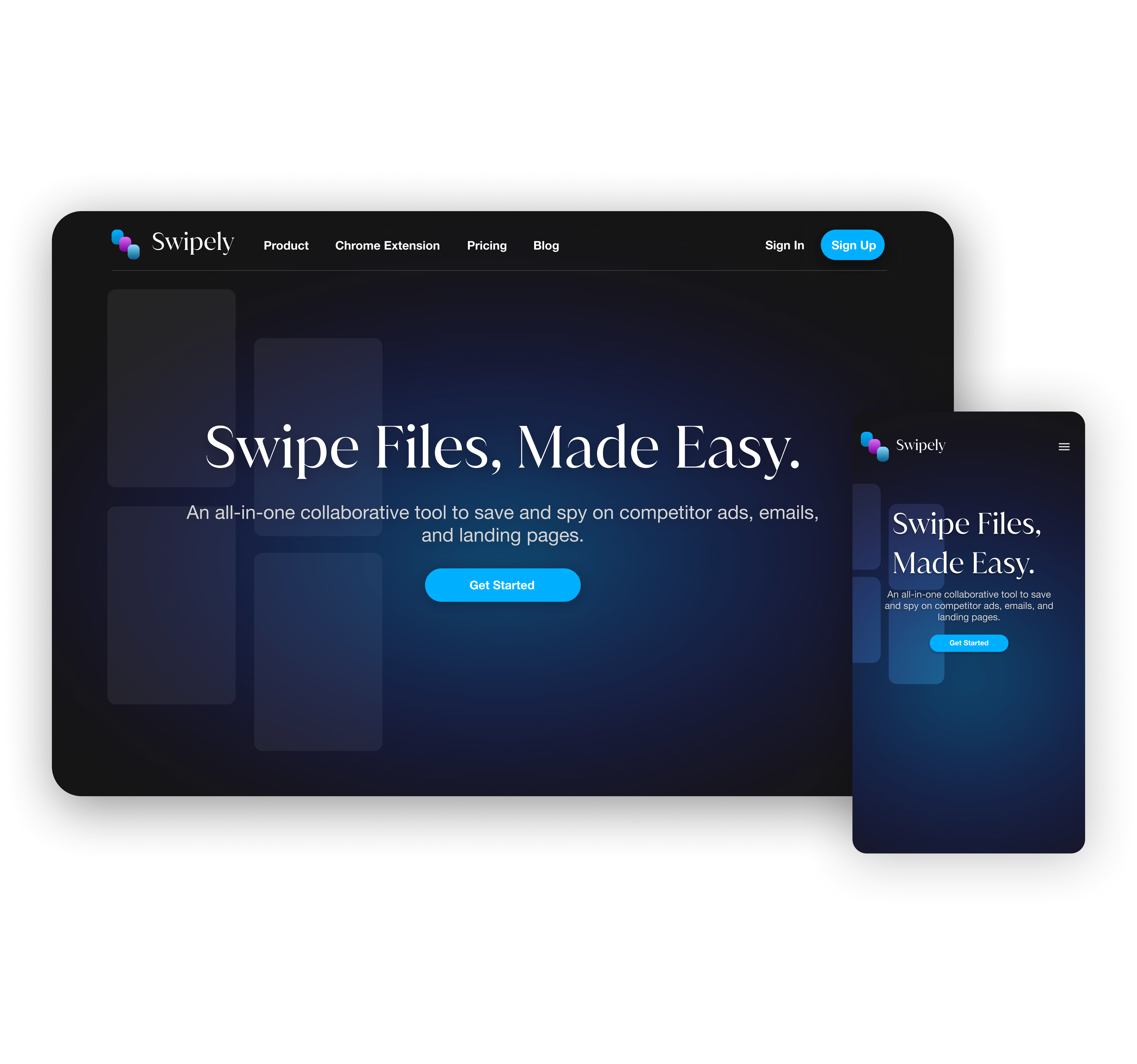
- Responsive Design: Design and showcase a responsive design that remains consistent across mobile and desktop devices.
- Task Sequencing: Optimize the sequence of tasks to ensure a logical and intuitive flow, minimizing the number of steps required to accomplish common user goals.
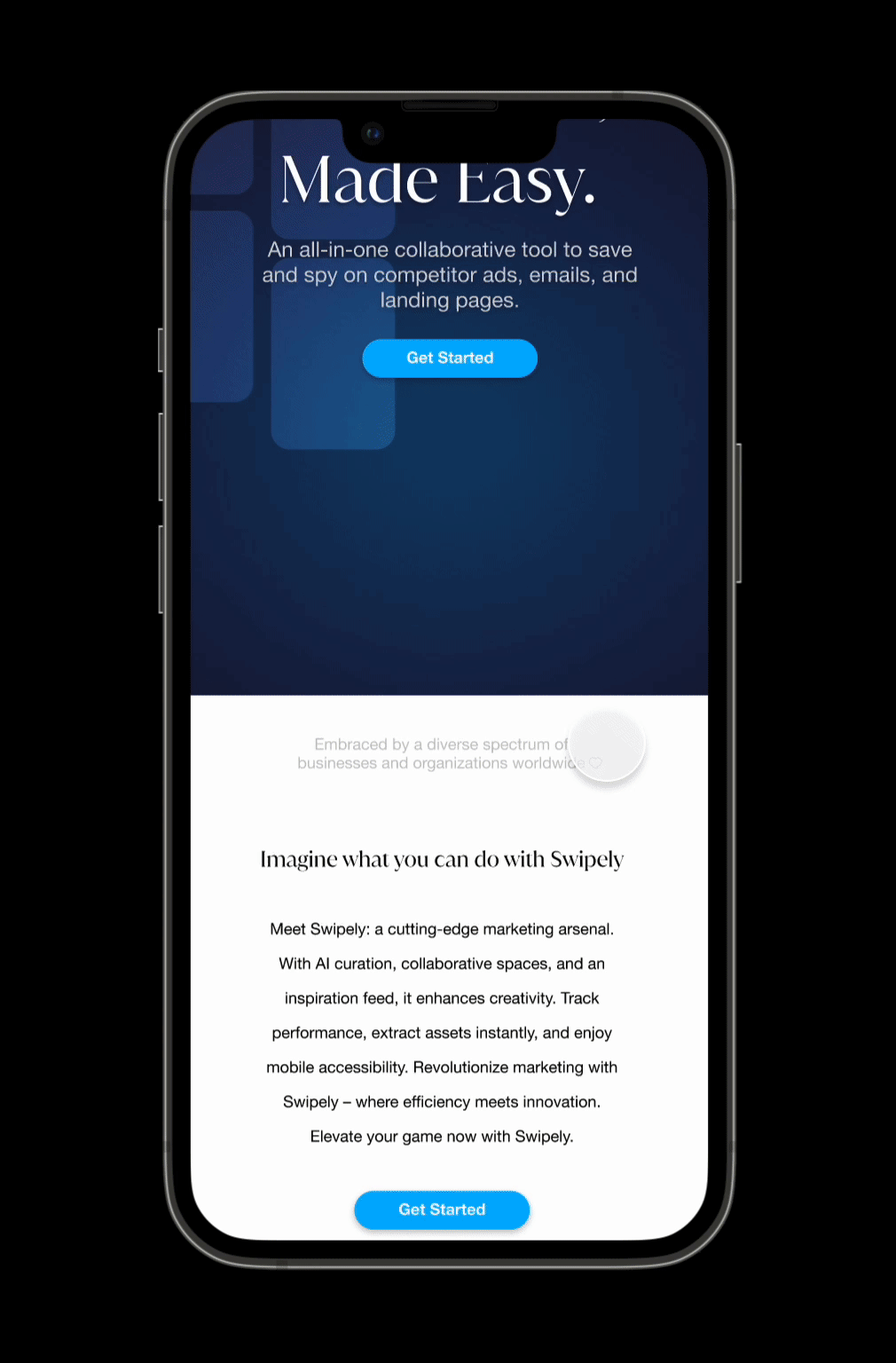
- Futuristic Visual Elements: Incorporate futuristic and sleek visual elements that convey a sense of innovation and align with the contemporary nature of AI technology.
- Continuous Learning through AI: Engage in continuous learning about AI advancements in design by exploring new tools, conduct competitor analysis, and staying updated on the latest AI applications in the design field.
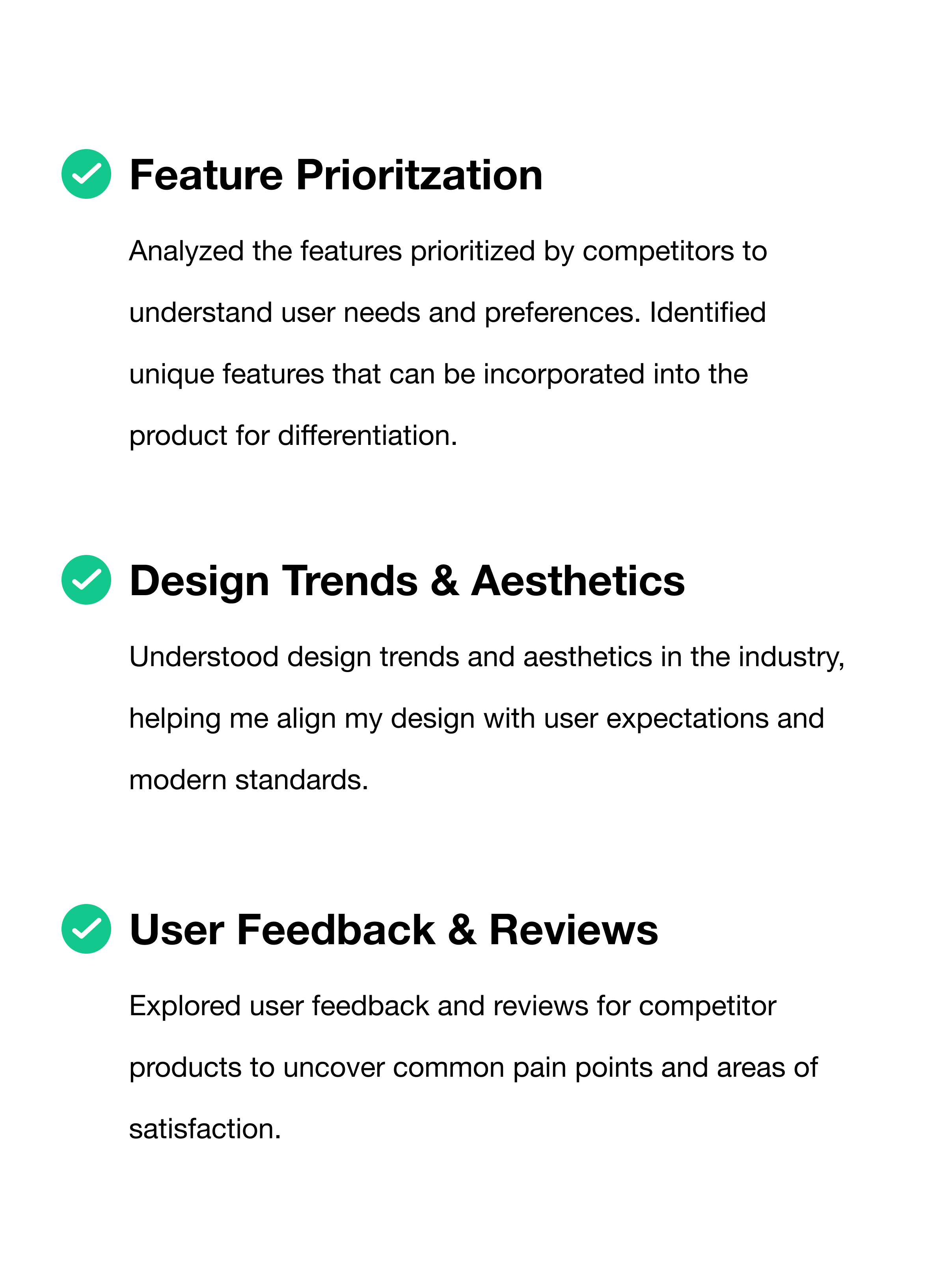
Moodboards & Competitor Analysis
The design process for Swipely's began with the creation of moodboards to explore the specific aesthetic vision, capturing elements of modern design, sophistication, and collaboration. These moodboards served as an inspiration, shaping the identity of the product. At the same time, I began to look into competitors to see their task flow as well as their visual design components, providing valuable insights into user expectations.
Insights:
Sitemap
In collaboration with the product team, our focus on the main task flow was essential in shaping the user experience for Swipely. Through analyzing the task sequencing, navigation, and competitor analysis results, we created a user-centric journey that balances simplicity and functionality. Responsive design considerations were incorporated to ensure a seamless experience across desktop and mobile platforms.